Thursday, 28 May 2015

Vivid Sydney 2015 - Don't miss it!

Vivid Sydney is back, and definitely as good as previous years . The light installations and accompanying music are incredible, pure bliss, and Sydney Harbour is really showcased to its full potential. Most of it is visual but some of it is interactive and tactile, and kids will love it just as much as adults.

The mesmerising beauty of the light shows and music is actually really relaxing, best enjoyed by simply wandering around, stopping, sitting and soaking it in. It's the perfect way to slow down and stop - something we don't often do in our busy, frenetic lives.

So go ahead, get caught up in the atmosphere and lose yourself www.vividsydney.com


Monday, 18 May 2015

All About Artist James Gulliver Hancock

James Gulliver Hancock

On 16th July, 2013, I was lucky enough to interview James Gulliver Hancock to find out more about him and his fascinating work…

James, can you describe your work in a few words?
My work is fun, whimsical and accessible. It’s all hand drawn and utilises print making and playful mark making.

I gather you’ve always been into drawing. Can you tell us a bit about your background and the path that led you to where you are today?
I have always drawn, ever since I was little. I remember using any opportunity to draw in school, my geography projects were visually stunning. I’m lucky enough now to be doing pretty much the same thing for my job. I recently did some work for children’s texts and communicating real world things in a fun way has been a delight.
I basically kept drawing after school, continued into Visual Communications at the University of Technology, got a design job at a firm ( which I hated ) and eventually ended up working for myself. Initially starting with small projects for friends and friends of friends, then after getting an agent in Australia and moving to the USA things really took off, with major international clients and side projects that garner lots of press and attention.


Above: Illustration for Teaching Tolerance Magazine about social reinforcement of gender in children

James Gulliver Hancock artist

Above: Editorial piece for Virgin inflight magazine on different kinds of gaming

We sell your All the Bicycles in Berlin and All the Scooters in Rome screenprints. Were you actually in those places when you did your drawings? And can you explain the actual screen-printing process?

Yes, I usually make these as a reaction to being in a place and wanting to re-present it for myself. They are like diary entries of an obsessive traveller. I usually keep a sketchbook, collecting all the things I see in a place ( like a sort of urban ornithologist ).
I then compile these on the computer and generate a film positive. This is then used to create a silkscreen stencil via a photographic process using light sensitive emulsion. Once this is completed and dried I can use this photo stencil to push ink through onto paper re-making the image in limited multiples. It’s a wonderful process that has a very hand made look. The ink really sits on top of the paper, and is super flat, I love what it does to drawings and to me is somewhere between an original and a digital print. They are unique collectibles, which often have small differences between each print, little off prints that make each one beautiful in it’s own right.

What or who inspires you and your work?

Everything inspires me, from the latest illustrator, to the latest science podcast. I keep a log of them here – www.gulliverstravels.tumblr.com

I understand you spend part of your time in Sydney and part in New York. Can you tell us a bit about living in the two places?

Yes, we like to call it living ‘bi-hemisphere’, they are very different places! We lived in LA and NYC for over 5 years, and loved it, American’s can be so confident and encouraging, it is an amazing place to go as an Australian to really push yourself and be welcomed professionally.
When we were about to give birth to our son we wanted to do it at home, with the family around, and once we returned we realised again what a blessing it was to have grown up in Australia. The nature is just unbeatable, and I wanted out baby boy to be able to experience that, he loves nature and it’s hard for him in New York, the parks are fun, but it’s a construct, it’s not a full natural experience. You see babies at the parks in New York, scared of the grass, it’s very sad. So now we go back and forth. Both my wife (www.lenkamusic.com)and I have international careers so it’s fun moving around working. We are in New York now, then Berlin, then LA, then home for Christmas!

What’s your favourite New York neighbourhood?

I’ve lived in a few, and each has their qualities for different times in your life. We lived in Carroll Gardens for a while and I would go back there now we have a baby, it’s a little more relaxed and kid-friendly than a lot of the other neighbourhoods. Manhattan is hard with a baby. I also will never stop loving Greenpoint, so much of my professional confidence grew from there, from seeing other similar creatives working hard at what they love. In Manhattan it’s the classics like the West Village and Lower East Side.

Where would you be on a typical Saturday morning?

In Sydney I’d be at Clovelly beach, in New York I’d be at the park in the water fountain with my son, then at the farmers market picking up some fresh local sea bass.

What is your proudest career achievement to date?

That I worked out how to have a creative family, travel around the world, and work for amazing different clients all the time.

Any upcoming exhibilitions?

Nothing planned as yet, but stay tuned.

James Gulliver Hancock Rome map
Above: The intricately detailed Rome Shopping Map

Watch this cute animation reel http://vimeo.com/23016881

You can buy James's wall art online at http://www.yellowfrontdoor.com.au/wallartonline/ and enjoy free delivery Australia-wide.

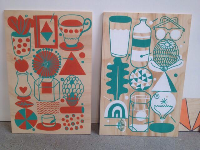
Since the above interview, James has had an exhibition at iconic Sydney store Koskela. He showcased his new designs, artworks, cushions and fabric. I love his quirky original drawings and the colourways he uses - teal, watermelon, yellow and tangerine.


What Makes Designer Sian Elin Tick?

I interviewed gorgeous Welsh designer Sian Elin to find out more about her designs and what inspired her. 
Image
Can you tell us a bit about your background? What was the catalyst that led you to launch Sian Elin and become a surface pattern designer?
I worked for five years as a children’s book designer in both London and Oxford, where I used to work with illustration and pattern quite a bit. I used to visit exhibitions like New Designers (which I just exhibited at) as part of my role, and it was there that I met young designers in the One Year On section exhibiting their designs on their own wares.
I’d always had an interest in interior design and products and so combining that with pattern seemed like the perfect union. In addition I’d always wanted to work for myself and obtained a keen interest in business whilst working for large publishing companies – and so I took the plunge in 2012 and developed my own brand.
Describe your design aesthetic or style?
I love geometric patterns, I find them addictive to look at. It may seem strange to some people since they are so abstract but you can find them in buildings and all over cities across the world, which I find really exciting.
Geometrics allow the perfect union of colour and shape which is what the Sian Elin brand is all about. I really love bold and modern designs, and am a big fan of mid-century modern.
Image
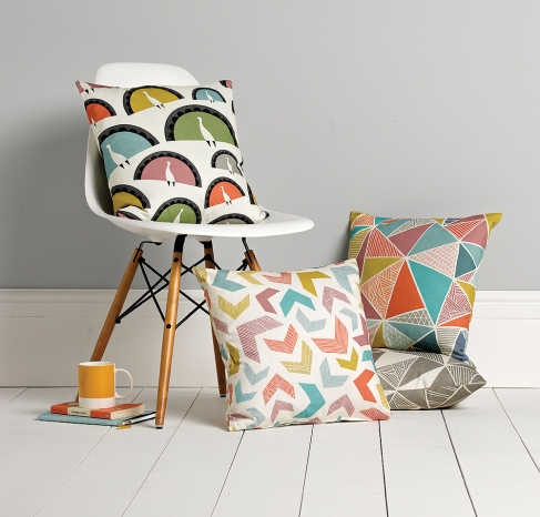
We sell a couple of your cushions (Peacocks and Tress). Can you explain the actual digital printing process?
I hand draw my patterns, and then I digitally colour them on screen. They then get digitally printed on a very large scale printer in the North of England, before making their way back to me to be sewn up in Wales.
I understand you are inspired a lot by your travels. Can you name some specific things that inspired you in the past, or inspire you now?
I am particularly drawn to Islamic patterns – and love the history and story behind them. The Alhambra in Spain is full to the brim with Moorish designs which are indescribably beautiful. I can’t quite believe that anyone was so clever as to design and make these beautiful tiles, and so many years ago. The Taj Mahal in India was a big inspiration for my first collection too.
I love traveling to different cities all over the world, and find them very exciting and inspiring. I like to try and capture some of the outside to put inside.
Can you describe a typical work day? Do you work from home or do you have a separate studio/workspace?
At the moment I work from home because I have the space, but am considering a co-working space, because I think it’s important to bounce ideas off other creatives.
A typical working day would be dealing with any orders, packaging, sending them out. Responding to emails, marketing my products online via social media etc. And working on new designs for my upcoming collection which I will be launching at Tent London this September.
Do you live in Cardiff? What’s the best kept secret in your local area?
I live just outside Cardiff in a small village which is very pretty and quiet. There is a beautiful vineyard down the road called Llanerch, which on a sunny day, makes you feel like you could be in the South of France!
What’s your favourite part of Wales?
Definitely the Pembrokeshire coast – growing up it’s been a constant source of inspiration and escapism for me. In fact parts of it remind me of the Australian coast!
What’s your proudest career achievement to date?
I guess just plucking up the courage to leave my full time job, and security, and start my business and get out there! It’s been a hard journey so far, but a very fun one and I wouldn’t change it for anything!
Can you share some tips for choosing and arranging cushions in the home?
You can definitely mix and match many cushions in lots of different styles in your home. The more the better! All you need to do is make sure the colours match or go, then you can go crazy with the styles. You can see how a couple of my cushions were styled alongside others in a recent magazine feature in Good Homes: www.sianelin.com/press-features/good-homes-magazine-july-2013/ 
Buy Sian's stunning cushions online at Yellow Front Door www.yellowfrontdoor.com.au There are five designs to choose from, which makes mixing and matching much easier for a cohesive, coordinated look. 

So You Can Buy Eco-Friendly Cushions from China

Tu Textiles creates beautiful organic cushions and was founded by two women from Australia and the US who, while living as expats in Beijing, were frustrated by the lack of good quality fabrics. The designs are a celebration of traditional Chinese symbols and architecture and the company are  committed to using production methods that are as ethical and environmentally-friendly as possible.
Before launching, the founders Rebecca and Jill spent months speaking to countless printers and weavers to find the most ecologically sound methods possible. The designs are printed onto GOTS-certified organic fabric, with every step in the production process meeting international ethical and ecological standards. They use the latest digital printing methods with water-based inks (although not strictly organic, they are considered extremely safe). The fabric is sewn into cushions at independent workshops in Beijing which allows them to support local businesses and craftsmanship.
Why organic? Making textiles can be very toxic, from the pesticides used in growing the fibers to the chemicals used in printing. Also, water and energy are often wasted in the process. All this contributes to soil, air and water pollution. Tu Textiles believes that supporting and encouraging cleaner, greener textile production is one way to make the world a healthier place.
The designs are a fresh, contemporary take on Chinese patterns, symbols, and architectural details that have been around for hundreds of years. It’s a great mix of old and new, East meets West. The designs are classic, timeless and sophisticated, yet have a freshness and uniqueness to them. The colours are bold and energetic, and many cushions come in several colourways to suit any interior. See the cushions and their inspiration for the designs below:
Enjoy free delivery when you buy these beautiful, environmentally friendly and socially aware cushions online at: http://www.yellowfrontdoor.com.au/cushionsonline/

Beautiful Linen Cushions from the UK


One of the best things about these wonderful Tamasyn Gambell cushions is that they coordinate so beautifully with each other without being matchy-matchy. The styles and colours are different but similar, and there are three different sizes. The patterns are geometric with a distinct Aztec flavour, while the colours all complement each other in burnt reds, yellows, greys, pale pinks and blues. 
The designs are hand screen-printed onto beautiful thick European linen, and each cushion is cut from a different part of the cloth, so no two cushions are exactly the same. Each is unique and has it's own character and that is part of their charm. 
Tamasyn Gambell studied textile design in London and worked for both high end and high street brands in fashion print design. But she became frustrated but the lack of innovation and wasteful production methods.
She decided to venture out on her own into homewares with her eponymous label, and now creates thoughtful, luxurious, beautiful pieces. She also works in the most eco-friendly way possible, using organic and water-based dyes and inks, and prints onto gorgeous Irish linen. 
Creative design, luxurious fabric and the hand-made process is what sets these cushions apart from mass-produced cushions you get at a generic store. If you value quality, creativity and individuality, buy some cushions online for yourself now! www.yellowfrontdoor.com.au


Wednesday, 13 May 2015

Choosing the Right Winter Cushions and Throws

Winter has really arrived today! A wonderful way to celebrate the change in season is to change your sofa and bedroom cushions and throws. Put away your light, bright summer cushions and throws and bring out or buy some warm, snuggly winter ones.
All Yellow Front Door winter cushions and throws are in merino wool or lambswool and are put to the “scratchy” test by myself! They are all really warm, super-soft, and 100% natural.
Knitting has made a bit of a comeback recently, and when I last visited London I noticed quite a few knitting and sewing shops, classes and cafes. All our wool throws and cushions come from the UK, with designers/knitters Gabrielle Vary and Sally Nencini putting much thought, time and love into their creations.
When choosing the right cushion or throw for your place, if you have a lot of colour in your existing furniture or decor, you might want to choose a neutral grey, such as the Sunset Throw or Birdie and Big Tree cushions, see below:


Alternatively, if you want to brighten up a neutral colour scheme, try the bright multicoloured Rainbow Check throw, or Citric Acid cushions - see below. These are a bright and sunny choice on a wintry grey day.


The designs are a fresh take on traditional patterns and motifs, and are inspired by heritage, culture, animals and nature.  View the range of Yellow Front Door wool throws and wool cushions online at yellowfrontdoor.com.au/ and enjoy free delivery Australia-wide and a full refund policy.

Black and White Wall Art

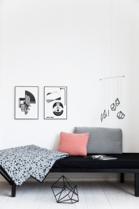
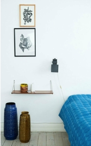
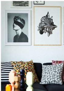
Creating a feature wall in your home with only black and white wall art can look really striking – especially when combined with a simple, minimal Scandinavian interiors. Look to muted monochromatic colours, Mid-century pieces, wood, pale or dark floors and a backdrop of white walls.
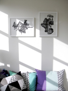
Yellow Front Door sells a number of black and white prints, like the pieces below from artist Kristina Dam. The focal point hero and "hero" piece is the Black Wall Structure, a simple piece made from a combination of glossy and matt 2mm thick cardboard (RRP $109) www.yellowfrontdoor.com.au/products/black-wall-structure-by-kristina-dam.html
Dam on wall
When arranging wall art, a good idea is to lay them out on the floor first so you can move them around and have a play with the layout to see what looks good. Alternatively, cut out newspaper in the correct shapes and sizes and use blue-tack to play around with them on the wall. 
Below: More artworks by Kristina Dam
Dam black and white on wall
Consider spacing between the artworks - they look best when spaced a similar distance apart. The art can be arranged in a number of different ways – in a cross shape, circular, v-shape or square. The number of artworks can vary also – two, three, four, or more.
black and white on wall 4 Black and white on wall 2
black and white on wall by bed black and white on wall6
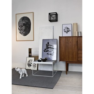
Another way to display black and white artworks is propped up on a table, sideboard or shelf, along with other display items, to create an interesting vignette.
Simple house on sideboard black and white on wall 3black and white on sideboard2 black and white on sideboard3
Art doesn't have to be a painting, photograph or print. Check out this striking piece on display at  MOMA www.moma.org/collection/object.php?object_id=81428
moma sculpture
Shop for black and white wall art online at www.yellowfrontdoor.com.au and get creative!

The Inspiring Swedish Home of Calligrapher Ylva Skarp


With brush in hand, Swedish designer Ylva Skarp creates beautiful calligraphy and brings letters to life on her cushions and artworks. 
In her work, Ylva uses her creative energy to turn calligraphy into patterns, shapes and forms. She mixes traditional Swedish craftmanship with contemporary ideas to create unique pieces, and her range of homewares includes prints, cushions, cards, calendars and ceramics. 
Currently Yellow Front Door stocks five of her black and white wall art, including “It’s Cool to be Kind” and “X” prints below. Shop online at www.yellowfrontdoor.com.au/wallartonline/
  
Yellow Front Door also stocks two of Ylva's cushion covers – “So Far” and “So Hard” – in stunning black calligraphy printed onto white cotton. They are extra large at 57cm x 57cm (suitable for a 60cm x 60cm insert) and look great on the sofa or bed. These two cushions coordinate well together, but also look great mixed and matched with other cushions, particularly in black, white and muted greys.
 
Ylva was educated at Roehampton Institute in London, and worked for 15 years as a professional calligraphy artist and designer. She then decided to set up her own company, designing her own unique range of homewares. Her inspiration came from watching a Nobel Prize ceremony on TV – featuring diplomas in beautiful calligraphy. Ylva had her “calling” and immediately knew it was the profession for her.
Ylva lives in a former schoolhouse in the small town of Leksand with her husband and two sons. Having lived in a large city, she wanted her sons to grow up in wide open spaces, and to experience the peace and quiet of the countryside. Ylva and her husband renovated the former schoolhouse, tearing down ceilings, walls and floor coverings to reveal the original integrity of the building.
Ylva’s work in evident in the home, with her stunning calligraphy and designs gracing the walls, floors and sofas. They give character and soul to the predominantly black, white, beige and grey home – see below.
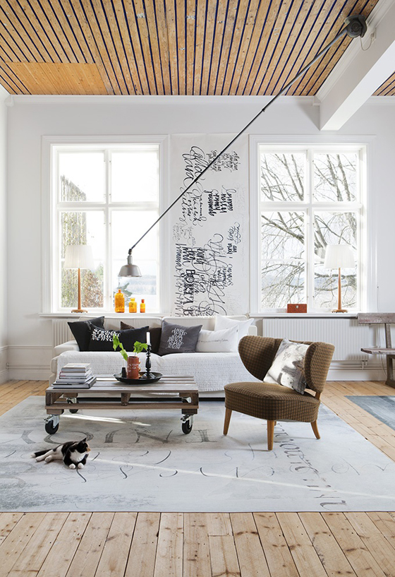
Above: white walls are off-set by a textured timber ceiling, pale wood floors, and soft greys and browns in the furnishings. The colour palette works well when limited to three colours.
Above: Bold yellow is juxtaposed against neutral colours, love the original Swedish fireplace.
Above: The dark wall works well against the pale floor. Note the bare windows to let in maximum light.
Ylva’s stunning home was featured in the March edition of Real Living magazine in Australia:
Ylva says-
“some elements may be a bit unexpected, but I can’t stand perfection – things need to be a little irregular”
“I like the thought of creating a striking image that also conveys a message”
Add beauty, personality and soul to your home – shop for Ylva Skarp’s cushions and wall art online at Yellow Front Door. You’ll find unique and creative pieces you won’t find elsewhere.